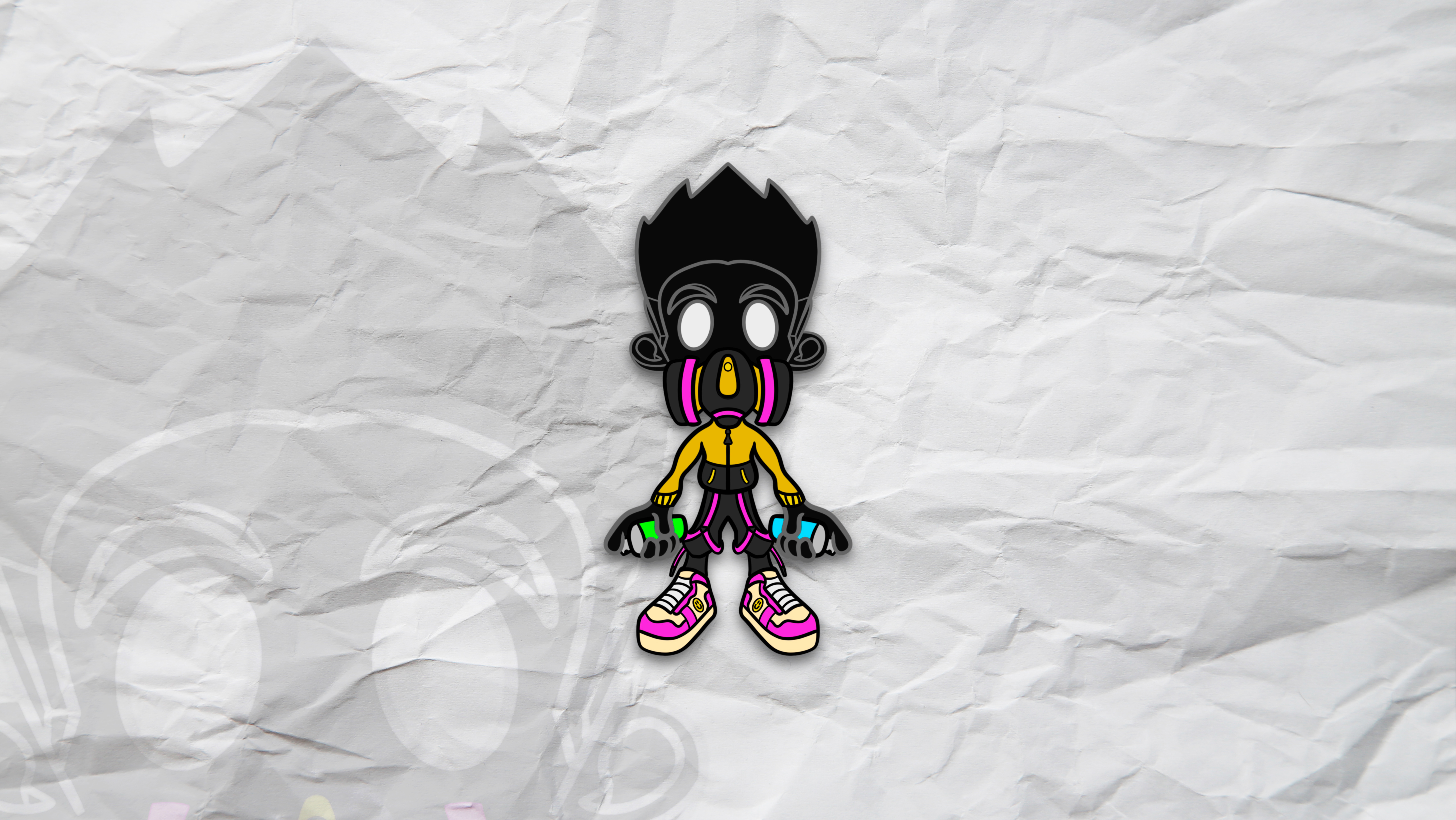
Original NeoVerse Logo
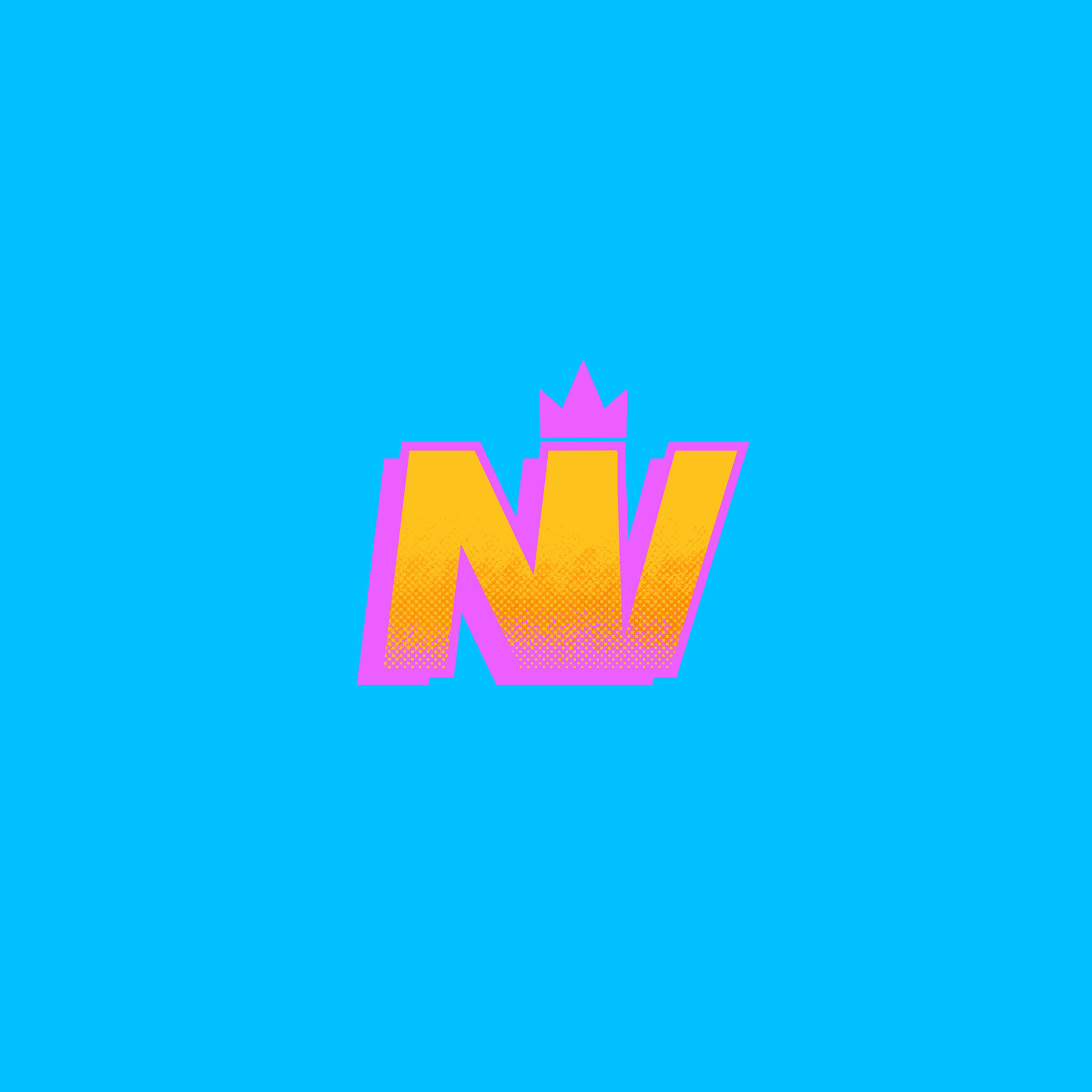
NeoVerse Logo (First Appearance 2021)
NeoVerse Logo (First Appearance 2021) | Grayscale
First Appearance: March 2021
Intense, vivid colors were used in my original design to represent my outgoing, energetic personality. Apart from that, I have always enjoyed the notion of creating a logo that is "loud" and makes a statement.
Neoverse Logo Revamp
NeoVerse Rebrand (v1)
NeoVerse Rebrand (v1.2)
NeoVerse Rebrand (v2)
NeoVerse Rebrand (v3)
NeoVerse Rebrand (v4)
NeoVerse Rebrand (v5)
July 2023
I chose to stick with the crown idea and expand on it. Additionally, to keep the logo more versatile in different situations, I simplified the color scheme to a specific shade of yellow.
Version 2:
I took a moment to scrap the regal emblem and find a different approach of symbolism to represent me. While hawks have always been fascinating animals to me, this logo is a nod to my original character Nighthawk.
Version 5:
In version 5, the crown icon is redesigned with a more complex twist including an embedded N and V with a pencil forming at the bottom of the logo.
Finalized Neoverse logo
Why Version 1.2?
Choosing between version 1.2 and version 5 was challenging. Even while I became very fond of version 5's many meanings, I found version 1.2's simplicity to become unbeatably iconic. Additionally, one could argue that this logo could translate better at different sizes.
After everything, Why a crown?
Find out on the About The Artist page!
Produced February 2024
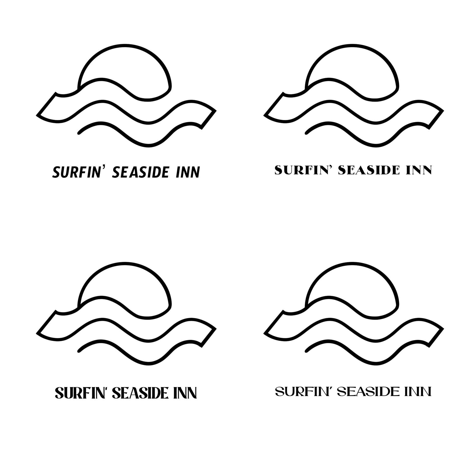
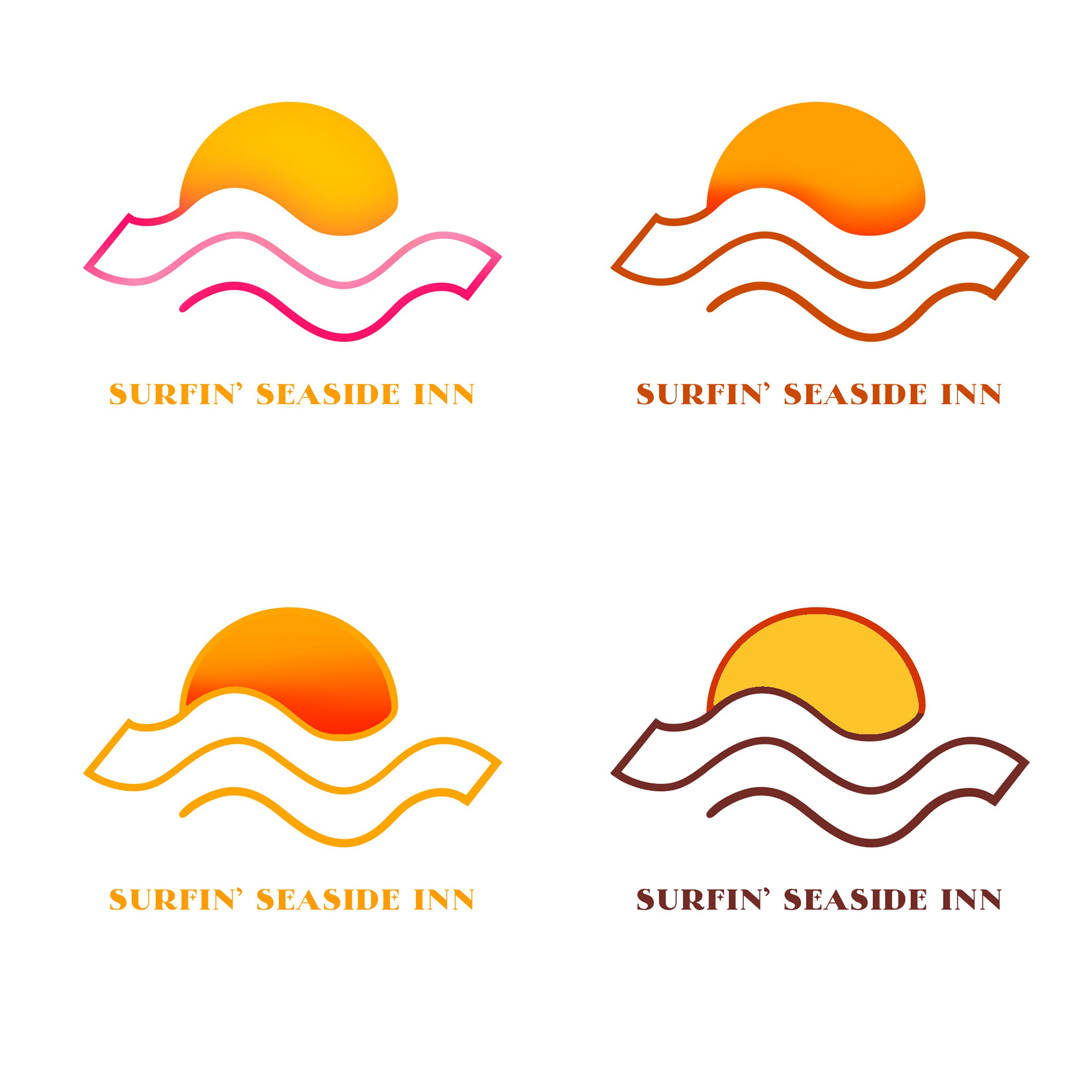
The wavy lines of the logo function both as a tidal wave and bacon.
Initial Concepts + Process:
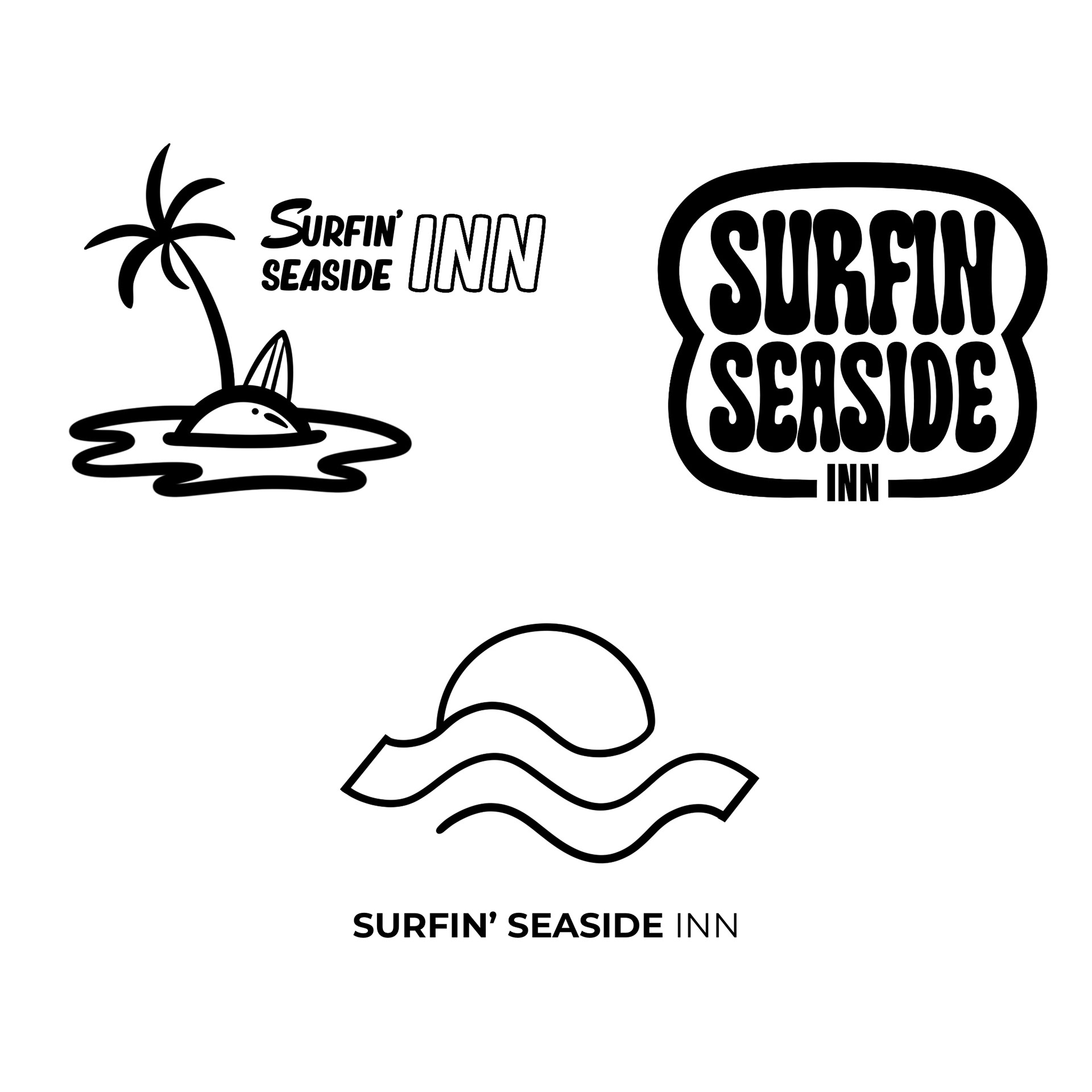
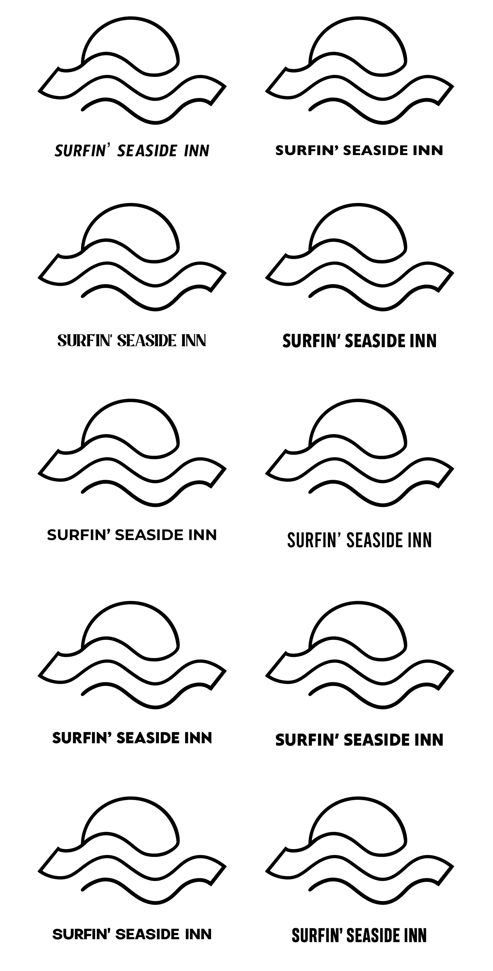
Client was in favor of the typeface on the top right.
The Comic Collective: Unique Museum Exercise
February 2024
Objective is to create a unique museum and brand the entire concept, thus I present "The Comic Collective."
This museum is about visual storytelling told throughout the decades, specifically comic books. Comic books, from my viewpoint, have always had a way of drawing readers in and making them feel as if they are actually living in the universe they are reading about.
Mission statement: Embark on an immersive odyssey through comic illustrators' eyes. Take a trip into The Comic Collective and experience the evolution of visual storytelling told throughout the decades.
Key inspirations + ideas:
- including "CC" in the logo
-I envision the museum to be a clean white space, therefore the logos are meant to capture a sleek, clean and minimalistic aesthetic
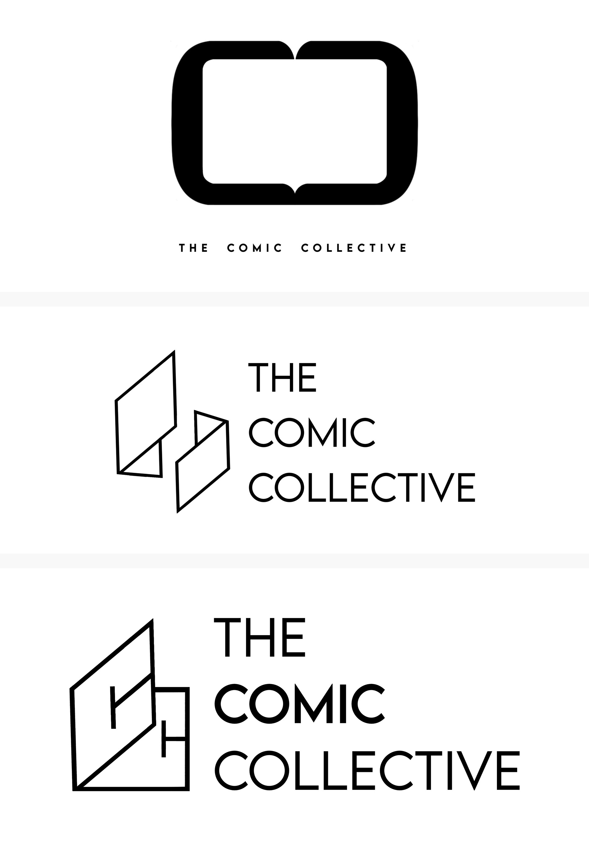
Initial concepts
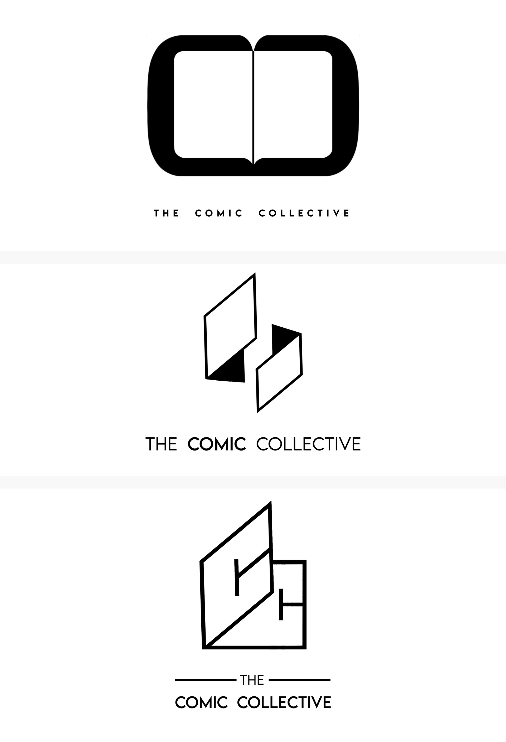
Refined logos
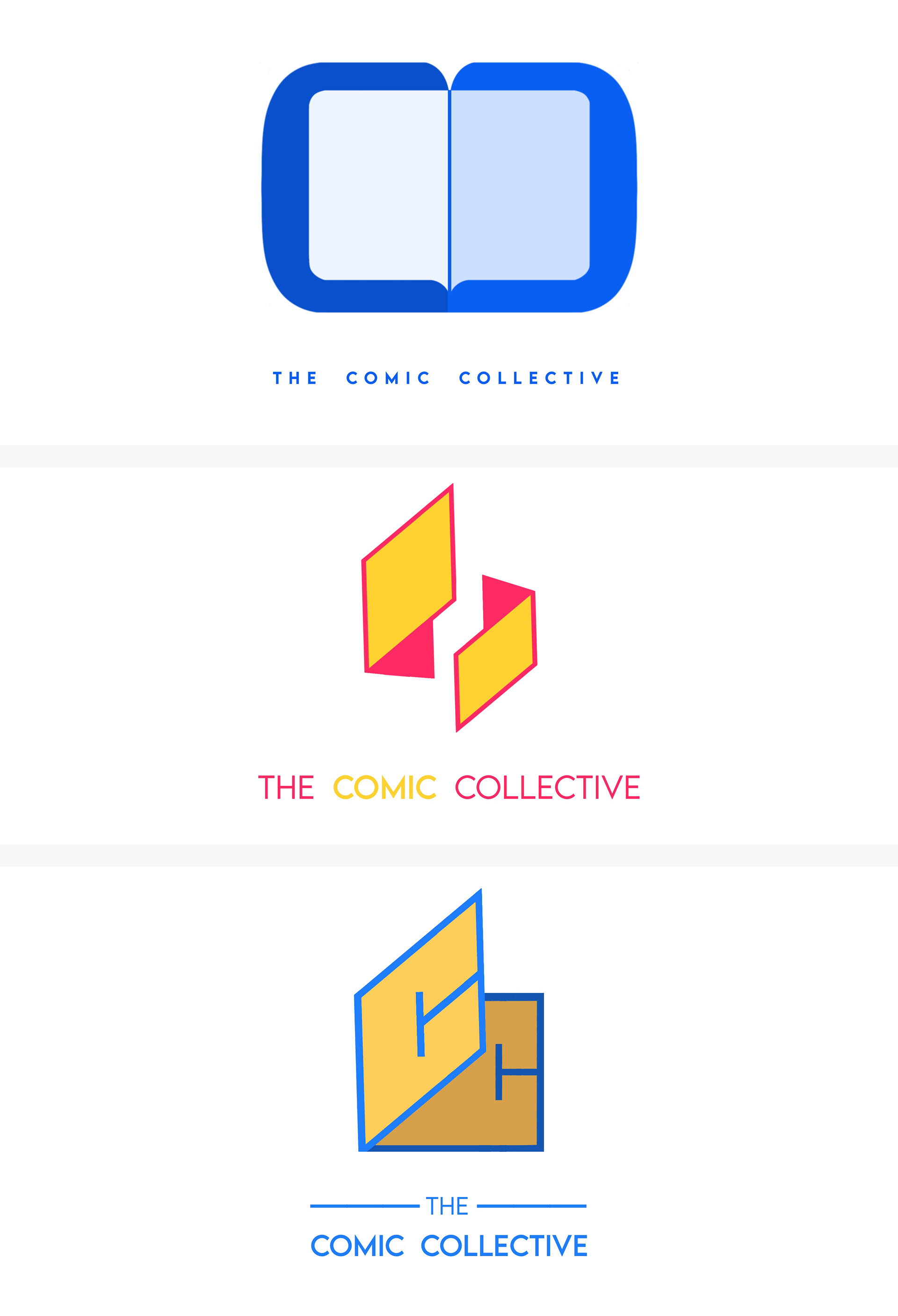
Refined logos + colorized
October 2022 | 25 Logos of My Name (Exercise)
Key Inspirations:
-Lightbulb = "Liwanag" is Tagalog for the word "light"
-Filipino flag colors = my culture
-Batman = I love Batman!
-Pencil and paint roller = I love to design and create
-smiley faces = I embrace positivity and happiness
-arrows = a representation of my optimistic spirit
-blue = my favorite color
-Lighting bolt + wing = ran track in high school
Gaming Mascot logos

December 2020

August 2021
September 2021
June 2022
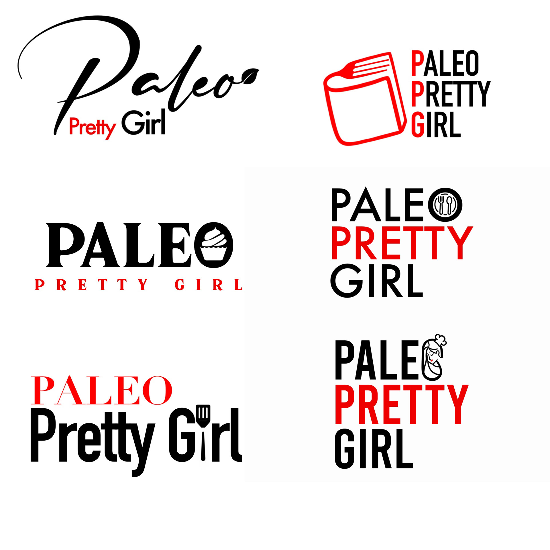
October 2021 | Paleo Pretty Girl Logo Design
Process of elimination by client:
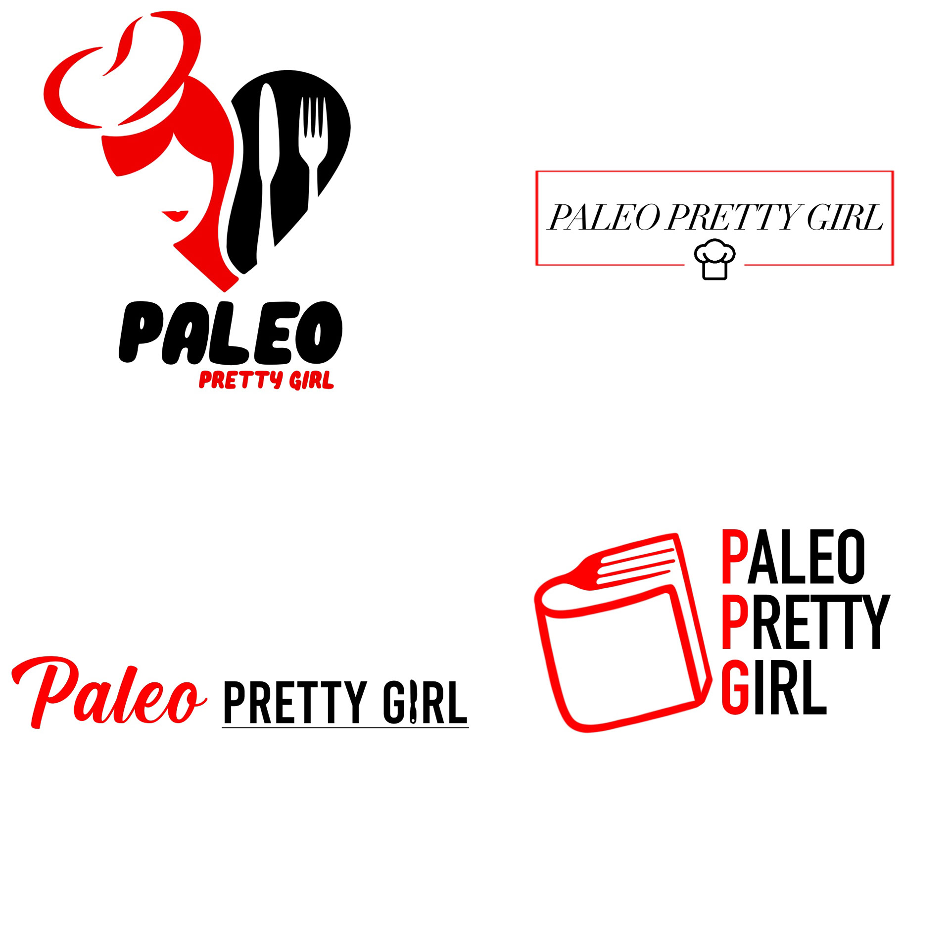
Stage 1
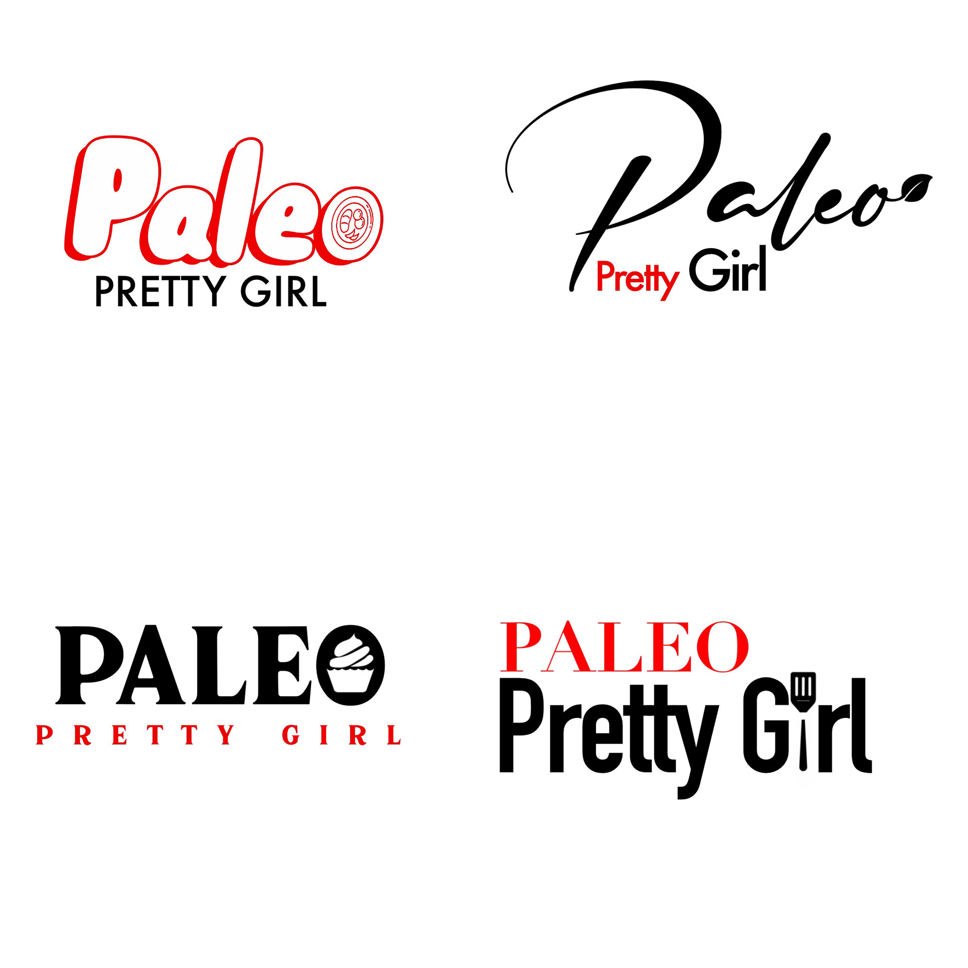
Stage 2
